 LinkedIn
Product Design Intern
Example Co. · Boston, MA
One listing, every source it appears on, fresh results, fewer wasted clicks.
Interncept is a free internship aggregator for students in the US. Instead of hosting applications, it sits above the job boards and company career sites as a discovery layer: it finds internships wherever they’re posted, collapses copies of the same role into a single listing, and links out to every place you can apply. I designed the product and its design system, wrote the full product specification, and directed an AI-assisted build from database schema to launch.

The idea
The same internship, found on three boards, becomes one listing with three places to apply.
Product Design Intern
Example Co. · Boston, MA
This was posted to:
'%3e%3cpath%20fill='%23fff'%20d='M42.471%2036.376c-5.138%202.636-10.89-2.277-9.098-7.767%201.8-5.492%209.342-6.055%2011.93-.888a6.43%206.43%200%200%201-2.83%208.661zm-6.896-20.869c5.289-1.924%2011.341-1.824%2015.87%202.11a7.7%207.7%200%200%201%202.193%202.938c.451%201.472-1.608-.153-1.884-.36a20.4%2020.4%200%200%200-4.611-2.353c-8.923-2.727-17.362%202.244-22.575%209.977a41.8%2041.8%200%200%200-4.822%2010.982%206.7%206.7%200%200%201-.451%201.382c-.234.436-.11-1.181-.11-1.23.193-1.614.503-3.222.921-4.797%202.419-8.427%207.777-15.443%2015.469-18.657zM35.65%2060.5V41.716a14%2014%200%200%200%201.574.084%2013.3%2013.3%200%200%200%206.906-1.917V60.49c0%201.768-.328%203.065-1.124%203.92a4%204%200%200%201-3.105%201.305%203.92%203.92%200%200%201-3.065-1.305c-.785-.863-1.195-2.168-1.195-3.91z'/%3e%3c/g%3e%3cdefs%3e%3cclipPath%20id='a'%3e%3cpath%20fill='%23fff'%20d='M10.714%2014.286h51.429v51.429h-51.43z'/%3e%3c/clipPath%3e%3c/defs%3e%3c/svg%3e)
'%3e%3cpath%20fill='%23fff'%20d='M44.52%2014.287a.265.265%200%200%200-.288.272v7.395c0%20.144.115.256.259.272%205.612.369%209.877%202.036%209.877%207.889h-12.04a.29.29%200%200%200-.267.178.3.3%200%200%200-.022.11v19.21c0%20.16.128.289.289.289h21.436c.16%200%20.288-.129.288-.289V30.019c0-4.795-1.713-8.691-5.177-11.417-3.19-2.501-7.973-4.01-14.354-4.315M16.239%2030.115a.286.286%200%200%200-.289.289v19.192c0%20.16.129.289.289.289h12.04c0%205.853-4.264%207.52-9.876%207.889a.277.277%200%200%200-.256.272v7.395c0%20.16.129.288.29.272%206.38-.305%2011.159-1.813%2014.35-4.315%203.463-2.726%205.177-6.622%205.177-11.417V30.404a.29.29%200%200%200-.29-.289z'/%3e%3c/g%3e%3cdefs%3e%3cclipPath%20id='a'%3e%3cpath%20fill='%23fff'%20d='M14.286%2014.286h51.43v51.429h-51.43z'/%3e%3c/clipPath%3e%3c/defs%3e%3c/svg%3e)
Product premises
I wrote these into the spec as rules the product doesn’t break without a deliberate change of intent.
Every listing passes a strict internship gate: rule-based triage first, then AI confirmation for anything ambiguous.
US roles under any arrangement, plus Canadian roles only when they’re fully remote.
Listings older than 30 days are never ingested, and the feed is pruned every day.
The same role on several boards collapses into one card with a tile for every place it’s posted.
Raw location strings are normalized into clean “City, ST” or “Remote” labels.
Apply always routes to the original posting. No auto-apply, no resume hosting.
Everything works without an account; signing in just syncs saved and applied roles across devices.
 No Handshake
Investigated and left out: its public pages return no internships and the rest sits behind a login.
How it works
Several times a day, a pipeline pulls fresh postings from every source and puts each one through the same gates before it can reach the feed.
Pull postings from job boards (LinkedIn, Indeed, Glassdoor, Dice, Monster), Google Jobs, 1,721 company career boards, curated GitHub feeds, The Muse, USAJOBS, Adzuna, RemoteOK and Remotive.
Keep, drop or flag. Clear internship signals are kept; full-time, senior and licensed-medical roles are dropped at zero AI cost; ambiguous ones need AI confirmation at 60%+ confidence.
US roles under any arrangement stay. Canadian roles stay only when they’re remote. Everything else is dropped.
Anything posted more than 30 days ago never enters the database, and the feed is pruned daily.
Messy location strings are normalized to clean “City, ST” or “Remote” labels applicants can scan.
Exact, cross-board and semantic matching. A duplicate doesn’t become a new card; it just adds another source tile to the listing that already exists.
Only genuinely new listings go to the AI step, which classifies category and type, with automatic failover between providers.
Postgres serves the feed in one call: filters, seven sort modes, synonym-aware search and infinite scroll.
Coverage


'%3e%3cpath%20fill='url(%23b)'%20d='M0%200h30.322v30.322H0z'%20transform='matrix(1%200%200%20-1%2042.931%2055.484)'/%3e%3c/g%3e%3cdefs%3e%3cpattern%20id='b'%20width='1'%20height='1'%20patternContentUnits='objectBoundingBox'%3e%3cuse%20xlink:href='%23c'%20transform='scale(.0122)'/%3e%3c/pattern%3e%3cimage%20xlink:href='data:image/jpeg;base64,/9j/4AAQSkZJRgABAgEAFQAVAAD/7AARRHVja3kAAQAEAAAAHgAA/+4AIUFkb2JlAGTAAAAAAQMAEAMCAwYAAAJzAAADBAAABAT/2wCEABALCwsMCxAMDBAXDw0PFxsUEBAUGx8XFxcXFx8eFxoaGhoXHh4jJSclIx4vLzMzLy9AQEBAQEBAQEBAQEBAQEABEQ8PERMRFRISFRQRFBEUGhQWFhQaJhoaHBoaJjAjHh4eHiMwKy4nJycuKzU1MDA1NUBAP0BAQEBAQEBAQEBAQP/CABEIAFIAUgMBIgACEQEDEQH/xACZAAEBAQADAQEAAAAAAAAAAAADBAABBQcCBgEBAQEBAQEAAAAAAAAAAAAAAwUBAgQAEAEBAAIABwEBAQAAAAAAAAAAAgEFMTIDMwQ0NRASExEAAQEGBQQCAwAAAAAAAAAAAgAQMAGxAwRx0XM0RDGSM5MyghEhYRIAAQIFBAMBAAAAAAAAAAAAARACACAxsXJxkTIDIUEiYf/aAAwDAQACEQMRAAAA/Tw1QLF5LgXz7L4JkQjJ+1frqO19I20P39FBfA0QhYXwiUn7IlJkKiehF9I20Gh0UF8DRCFhfCJSfsiUmQqJ6EX0jbQaHRQXwNEIWF8IlJ+yJSZConoRfSNtBodFBfA0QhYXwiUn7IlJkKiehF9I20GhOe2hxxt19x87dbxxt1vH1tu9ltvOn//aAAgBAgABBQCMJxhMymJVE/wjhKUq7aOEpSrto4SlKu2jhKUq7bDDDDPB/9oACAEDAAEFAOtdf64umKpiqRWf6dbvYYYRzOt3sMMI5nW72GGEczrd7DDCOZXH9x+f/9oACAEBAAEFANl1+vHlV5flK8zzFed5qvP85Ww89Wy2CtnslbTZtVstj1No2vuUpSlKUpp/rtr7lKUpSlKaf67a+5SlKUpSmn+u2vuUpSlKUpp/rtr7lKUpSlKaf67a+5SlKUpSmn+u2vuUpSlKUpp/rtr7lKUpSlKaf67a+5SlKUpSmn+u6vOyyz+ZZZdHvP/aAAgBAgIGPwARQRQRxG0O+W8T6QSPxNkEj8TZBI/E2QSPxNpin//aAAgBAwIGPwDs+jzd7/Y5O3ip3ip3geTVOzN15BqE7M3XkGoTszdeQahOzN15BqEOs3//2gAIAQEBBj8AIQqEI/iH6gUYQ6LzVO8s156neWa3FXvLNbmr3lmtzW9hZrdVvYWa3db2Hmt5X9p5q1p1LqsYFVGBCVQowjCMekYRiw8Bk5s9YJsPAZObPWCbDwGTmz1gmw8Bk5s9YJsPAZObPWCbDwGTmz1gmw8Bk5s9YJsPAZObPWCbDwGTmz1gmyPi+/VcdcdcZcVcRcNcJcFBs+sPh8/r/Wf/2Q=='%20id='c'%20width='82'%20height='82'%20preserveAspectRatio='none'/%3e%3c/defs%3e%3c/svg%3e)
'%3e%3cpath%20fill='%23fff'%20d='M48.965%2027.826a11.5%2011.5%200%200%201-2.708%207.464c-1.868%202.228-4.576%202.785-4.576%204.68%200%202.562%203.455%201.782%206.77%205.737C50.646%2048.325%2052%2051.779%2052%2055.79c0%207.91-5.323%2014.204-12%2014.204S28%2063.7%2028%2055.795c0-4.016%201.354-7.47%203.549-10.088%203.315-3.955%206.77-3.175%206.77-5.738%200-1.894-2.708-2.45-4.576-4.679-1.68-2.005-2.708-4.568-2.708-7.576%200-5.793%203.969-10.472%208.825-10.472.934%200%201.774.167%202.475.167%201.26%200%201.914-.669%201.914-1.727%200-.613-.233-1.393-.233-2.228%200-1.894%201.354-3.454%202.988-3.454s2.942%201.615%202.942%203.565c0%202.061-1.355%203.008-2.382%203.454-.84.334-1.494.78-1.494%201.782%200%201.894%202.895%203.733%202.895%209.025m-.934%2027.97c0-5.516-3.408-9.972-8.031-9.972s-8.031%204.456-8.031%209.971c0%205.46%203.408%209.971%208.031%209.971s8.031-4.517%208.031-9.97m-2.755-28.082c0-3.51-2.381-6.406-5.276-6.406s-5.276%202.897-5.276%206.406S37.105%2034.12%2040%2034.12s5.276-2.896%205.276-6.406'/%3e%3c/g%3e%3cdefs%3e%3cclipPath%20id='a'%3e%3cpath%20fill='%23fff'%20d='M28%2010h24v60H28z'/%3e%3c/clipPath%3e%3c/defs%3e%3c/svg%3e)

'%3e%3cpath%20d='M40.1%2045.243v.592h-5.76v-.591c.917%200%201.035-.243%201.035-1.433V31.988c0-1.19-.283-1.335-1.27-1.335v-.603h4.962v6.92c.494-1.043%201.717-2.088%203.175-2.088%202.187%200%203.34%201.579%203.34%203.522v5.406c0%201.19.117%201.433%201.034%201.433v.592h-5.762v-.592c.917%200%201.035-.243%201.035-1.433v-4.945c0-1.627-.658-2.258-1.529-2.258-.517%200-.987.315-1.293.971v6.232c0%201.19.117%201.433%201.035%201.433'/%3e%3cpath%20fill-rule='evenodd'%20d='m52.55%2045.822-4.845.01V31.99c0-1.19-.282-1.336-1.27-1.336v-.604h4.962v6.605c.47-.728%201.529-1.773%203.034-1.773%202.493%200%204.21%202.016%204.21%204.955%200%203.74-2.015%205.985-6.092%205.985m-.141-.583c1.175%200%202.446-.819%202.446-4.674%200-2.526-.73-4.153-2.14-4.153-.472%200-1.09.35-1.318%201.12v7.709z'%20clip-rule='evenodd'/%3e%3cpath%20d='M31.283%2043.964c0%20.899-.635%201.409-1.6%201.409-1.622%200-2.634-1.336-2.893-3.279h-.596v3.742h.597c0-.323.16-.49.419-.49.102%200%20.235.071.418.17.404.215%201.05.561%202.15.561%202.328%200%204.163-1.433%204.163-3.715%200-1.482-.847-2.502-2.164-3.255l-1.693-.922c-.659-.365-1.176-.705-1.176-1.385%200-.704.517-1.214%201.317-1.214%201.458%200%202.34%201.113%202.458%202.708h.576v-3.242h-.583c0%20.293-.189.415-.47.415-.132%200-.286-.071-.488-.164-.376-.173-.917-.421-1.776-.421-2.022%200-3.833%201.335-3.833%203.448%200%201.385.682%202.356%201.834%202.963l1.811.971c.918.51%201.53.85%201.53%201.7'/%3e%3cpath%20fill-rule='evenodd'%20d='M14.56%2045.277v.558h-4.54v-.558c1.176%200%201.647-.267%202.07-1.433l4.422-12.75h2.093l4.868%2012.75c.47%201.19.705%201.433%201.717%201.433v.558h-7.136v-.558c1.693%200%201.835-.158%201.327-1.433l-1.294-3.497H14.16l-1.153%203.424c-.336%201.158-.263%201.506%201.553%201.506m1.458-10.467-1.6%204.784h3.387z'%20clip-rule='evenodd'/%3e%3cpath%20d='m63.822%2045.255-3.904-8.292c-.493-1.068-.635-1.262-1.41-1.262v-.597h6.114v.597c-1.254%200-1.088.39-.747%201.189l.002.005.04.093%201.834%204.26%201.67-3.927c.512-1.257.64-1.627-1.153-1.627v-.59h3.692v.59c-1.005%200-1.033.066-1.5%201.155q-.084.2-.193.448l-3.316%207.375c-1.087%202.387-1.359%203.005-2.152%204.407-.287.487-.808.916-1.524.916-.954%200-1.727-.798-1.727-1.783s.773-1.783%201.727-1.783c.61%200%201.145.326%201.452.819z'/%3e%3c/g%3e%3cdefs%3e%3cclipPath%20id='a'%3e%3cpath%20fill='%23fff'%20d='M10%2030h60v20H10z'/%3e%3c/clipPath%3e%3c/defs%3e%3c/svg%3e)


'%20d='M.714.714h78.571v78.571H.714z'/%3e%3cpath%20stroke='%23000'%20stroke-width='1.429'%20d='M.714.714h78.571v78.571H.714z'/%3e%3cpath%20fill='%239da8e0'%20d='m70.96%2035.419-.045.217s0%20.043.044.043h.216v.826s0%20.043.045.043h.173s.043%200%20.043-.043v-.867h.217s.043%200%20.043-.043v-.173s0-.043-.043-.043h-.694v.043-.003'/%3e%3cpath%20fill='%239da8e0'%20d='m72.79%2035.42-.041-.043h-.042l-.337.695-.378-.65h-.084s-.042%200-.042.043l-.168%201.042s0%20.043.042.043h.168s.043%200%20.043-.043l.125-.52.252.52h.127l.21-.52.084.476s0%20.043.041.043h.168s.042%200%20.042-.043z'/%3e%3cpath%20fill='%239da8e0'%20d='M58.309%2046.84v-4.291h-4.053v4.29h-2.88V35.378h2.88v4.572h4.053v-4.572h2.837V46.84z'/%3e%3cpath%20fill='%239da8e0'%20d='m68.686%2046.84-2.125-3.952h-2.026v3.952H61.67V35.377h6.017c1.927%200%203.387%201.403%203.44%203.28v.1c0%201.224-.565%202.191-1.634%202.799l-.316.18%202.523%205.102h-3.01zm-4.362-5.96h2.24c.92-.058%201.6-.862%201.554-1.835-.005-.995-.697-1.773-1.577-1.773h-2.216z'/%3e%3cpath%20fill='%23fff'%20d='M27.28%2036.843a4.93%204.93%200%200%200-2.27-1.476q-.676-.249-1.557-.25c-2.373%200-4.325%201.463-5.096%203.815-.527%202.142-.325%202.857.003%204.145.722%202.364%202.737%203.894%205.135%203.894q.332%200%20.636-.038c2.344-.181%203.2-1.688%203.2-1.688l.125%201.43h2.822V35.287H27.45l-.168%201.556zm-6.312%204.2c0-1.598%201.348-2.948%202.944-2.948s2.944%201.35%202.944%202.949c0%201.597-1.349%202.949-2.944%202.949-1.596%200-2.944-1.352-2.944-2.95'/%3e%3cpath%20fill='%23fff'%20d='M30.796%2038.141h5.737l-5.737%205.664v2.904h9.857V44.03H34.37l6.324-5.674v-2.98h-9.9z'/%3e%3cpath%20fill='%23fff'%20d='M50.855%2035.377h-9.64v2.765h5.562l-5.561%205.664v2.904h9.639v-2.679h-5.988l5.988-5.671v-2.982'/%3e%3cpath%20fill='%23fff'%20d='M8%2046.97v-3.093h2.33c1.745%200%203.551-1.523%203.551-4.072v-6.772h3.628v7.839c-.284%203.7-3.103%206.099-7.179%206.099z'/%3e%3cdefs%3e%3clinearGradient%20id='a'%20x1='9'%20x2='99.5'%20y1='40'%20y2='40'%20gradientUnits='userSpaceOnUse'%3e%3cstop%20stop-color='%236c07ad'/%3e%3cstop%20offset='1'%20stop-color='%23217ccf'/%3e%3c/linearGradient%3e%3c/defs%3e%3c/svg%3e)


'%20d='M.714.714h78.571v78.571H.714z'/%3e%3cpath%20stroke='%23000'%20stroke-width='1.429'%20d='M.714.714h78.571v78.571H.714z'/%3e%3cpath%20fill='%23fff'%20d='M60.182%2035.786a18.4%2018.4%200%200%200-4.728-10.772%2018.63%2018.63%200%200%200-10.251-5.722%2018.4%2018.4%200%200%200-11.602%201.697%2018.38%2018.38%200%200%200-8.224%208.405c-4.132.118-8.066%201.815-10.926%204.814-2.861%202.998-4.49%206.984-4.45%2011.127a15.94%2015.94%200%200%200%204.609%2011.048C17.55%2059.303%2021.483%2061%2025.615%2061h31.746c3.099-.04%206.119-1.184%208.423-3.275a12.9%2012.9%200%200%200%204.132-8.09%2012.8%2012.8%200%200%200-2.225-8.798c-1.788-2.526-4.45-4.301-7.51-5.051m-2.86%2021.939H25.614a12.36%2012.36%200%200%201-8.661-3.67c-2.305-2.328-3.616-5.445-3.616-8.72a12.37%2012.37%200%200%201%203.497-8.76%2012.32%2012.32%200%200%201%208.621-3.788l1.59-.04c2.741.04%205.92%202.25%206.675%205.21.953%203.708-1.073%207.536-4.57%208.483-1.31.355-2.662.315-3.933-.197-1.271-.395-1.987-.198-2.344.552-.358.75-.16%201.38.755%202.052%201.947.907%204.132%201.105%206.198.513%205.046-1.42%208.026-6.906%206.675-12.272a9.94%209.94%200%200%200-2.821-4.656%209.53%209.53%200%200%200-4.887-2.407%2015.34%2015.34%200%200%201%206.913-6.353%2015.2%2015.2%200%200%201%209.337-.986%2015.06%2015.06%200%200%201%208.105%204.735c2.146%202.407%203.417%205.445%203.735%208.641l.199%202.407%202.344.553c2.225.552%204.212%201.894%205.523%203.748a9.72%209.72%200%200%201%201.668%206.51c-.238%202.29-1.35%204.42-3.059%205.959a9.04%209.04%200%200%201-6.238%202.486'/%3e%3cdefs%3e%3clinearGradient%20id='a'%20x1='0'%20x2='80'%20y1='33'%20y2='40'%20gradientUnits='userSpaceOnUse'%3e%3cstop%20stop-color='%233ad78c'/%3e%3cstop%20offset='1'%20stop-color='%2300b2c7'/%3e%3c/linearGradient%3e%3c/defs%3e%3c/svg%3e)


'%3e%3cpath%20fill='%23ece0f5'%20d='M0%200h80v80H0z'/%3e%3cpath%20fill='%23ece0f5'%20d='M55.713.42H24.287C11.122.42.45%2011.1.45%2024.274v31.451C.45%2068.9%2011.122%2079.58%2024.287%2079.58h31.426c13.166%200%2023.838-10.68%2023.838-23.855v-31.45C79.551%2011.1%2068.88.42%2055.713.42'/%3e%3cpath%20fill='%235a1cb7'%20d='M28.243%2036.862a8.443%208.443%200%200%201%208.445%208.45v11.02c0%204.634-3.74%208.414-8.409%208.414H19.8V45.313c0-4.67%203.777-8.414%208.444-8.414z'/%3e%3cpath%20fill='%23e23393'%20d='M28.243%2032.404c-4.667%200-8.445-3.78-8.445-8.414s3.778-8.414%208.445-8.414c4.668%200%208.445%203.78%208.445%208.414s-3.777%208.414-8.445%208.414'/%3e%3cpath%20fill='%235a1cb7'%20d='M60.023%2064.71h-8.445a8.404%208.404%200%200%201-8.408-8.415V45.276c0-4.67%203.777-8.414%208.445-8.414%204.667%200%208.444%203.78%208.444%208.414V64.71z'/%3e%3cpath%20fill='%235a1cb7'%20d='M51.615%2015.537c4.667%200%208.408%203.78%208.408%208.414s-3.777%208.45-8.408%208.45c-4.632%200-8.445-3.78-8.445-8.45s3.777-8.414%208.445-8.414'/%3e%3c/g%3e%3cpath%20stroke='%23000'%20stroke-width='1.429'%20d='M.714.714h78.571v78.571H.714z'/%3e%3cdefs%3e%3cclipPath%20id='a'%3e%3cpath%20fill='%23fff'%20d='M0%200h80v80H0z'/%3e%3c/clipPath%3e%3c/defs%3e%3c/svg%3e)
'%3e%3cpath%20fill='%2373c41e'%20d='M0%200h80v80H0z'/%3e%3cpath%20fill='%23fff'%20d='m10.067%2018.96%2055.372-6.544V66.11l-55.372-3.86z'/%3e%3cpath%20fill='%2372c41c'%20fill-rule='evenodd'%20d='M38.04.02q19.256-.536%2032.123%2013.603%2012.28%2014.738%209.192%2033.824-3.508%2016.563-17.418%2026.057-15.86%2010.01-34.283%204.595-13.044-4.422-20.91-15.763-9.34-14.506-5.746-31.48Q5.21%2014.53%2019.38%205.626%2027.968.591%2038.04.02m-4.504%2021.047q1.966.136%203.952.092-.046%207.951.092%2015.901%202.845-3.077%206.894-3.722%206.978-1.01%2012.086%203.814%205.559%206.145%202.987%2014.109-2.017%205.138-6.985%207.537-7.477%202.995-14.155-1.47-4.51-3.669-4.825-9.514-.069-13.372-.046-26.746m-12.224.46q5.964%203.05%207.904%209.513a312%20312%200%200%201%202.114%207.123%20290%20290%200%200%201-4.687-.781%2018%2018%200%200%201-4.78-2.114%2019.5%2019.5%200%200%201-2.344-2.16%2051%2051%200%200%200-8.042-8.226q1.877.105%203.676.69%204.665%201.499%208.732%204.181a76%2076%200%200%201%205.469%205.377l.138-.092a208%20208%200%200%200-3.769-7.353%2053%2053%200%200%200-2.297-3.492%2076%2076%200%200%201-2.114-2.666'%20clip-rule='evenodd'%20opacity='.992'/%3e%3cpath%20fill='%2372c41c'%20fill-rule='evenodd'%20d='M46.404%2036.784q7.524.148%209.697%207.353%201.215%205.298-2.206%209.468-4.362%204.05-10.156%202.435-7.443-3.09-6.48-11.167%201.722-7.405%209.145-8.089'%20clip-rule='evenodd'%20opacity='.982'/%3e%3c/g%3e%3cpath%20stroke='%2304003f'%20stroke-width='1.429'%20d='M.714.714h78.571v78.571H.714z'/%3e%3cdefs%3e%3cclipPath%20id='a'%3e%3cpath%20fill='%23fff'%20d='M0%200h80v80H0z'/%3e%3c/clipPath%3e%3c/defs%3e%3c/svg%3e)

'%3e%3cpath%20fill='url(%23b)'%20d='M47.864%2042.798h-5.136v8.307c.008%207.535-5.97%2013.7-13.47%2013.895a2.795%202.795%200%200%201-2.836-2.755%202.796%202.796%200%200%201%202.743-2.848h.177c4.383-.244%207.813-3.883%207.816-8.292v-8.307h-2.07a2.795%202.795%200%200%201-2.79-2.801%202.795%202.795%200%200%201%202.79-2.802h2.07v-8.298C37.152%2021.341%2043.162%2015.166%2050.685%2015a2.797%202.797%200%200%201%202.727%202.863%202.795%202.795%200%200%201-2.85%202.74c-4.393.233-7.834%203.878-7.833%208.294v8.308h5.136c1.54%200%202.79%201.254%202.79%202.801a2.795%202.795%200%200%201-2.79%202.801zM25.663%2062.205a3.69%203.69%200%200%201%201.497-2.97c-4.139-.888-6.943-4.77-6.5-8.997s3.99-7.437%208.223-7.44h3.955a3.7%203.7%200%200%201-1.282-2.801%203.7%203.7%200%200%201%201.282-2.802h-3.955c-7.237%200-13.253%205.596-13.805%2012.843-.553%207.246%204.545%2013.697%2011.698%2014.803a3.7%203.7%200%200%201-1.113-2.636m27.448-47.05a3.697%203.697%200%200%201-.387%205.603c4.161.87%206.99%204.764%206.544%209.01-.447%204.244-4.023%207.46-8.274%207.437h-.886a3.7%203.7%200%200%201%201.282%202.801%203.7%203.7%200%200%201-1.282%202.801h.886a13.84%2013.84%200%200%200%2011.525-6.218%2013.96%2013.96%200%200%200%201.229-13.08%2013.81%2013.81%200%200%200-10.637-8.353'/%3e%3c/g%3e%3cdefs%3e%3clinearGradient%20id='b'%20x1='15.041'%20x2='64.842'%20y1='40.003'%20y2='40.003'%20gradientUnits='userSpaceOnUse'%3e%3cstop%20stop-color='%233186c8'/%3e%3cstop%20offset='.18'%20stop-color='%23269fca'/%3e%3cstop%20offset='.38'%20stop-color='%231db4cc'/%3e%3cstop%20offset='.5'%20stop-color='%231abbcd'/%3e%3cstop%20offset='1'%20stop-color='%236fc6aa'/%3e%3c/linearGradient%3e%3cclipPath%20id='a'%3e%3cpath%20fill='%23fff'%20d='M15%2015h50v50H15z'/%3e%3c/clipPath%3e%3c/defs%3e%3c/svg%3e)
'%20d='M12.002%2043.44v-.052a.32.32%200%200%201%20.275-.352H29.99a.28.28%200%200%201%20.256.23c3.392%2012.85%206.61%2017.138%209.4%2017.138%203.879%200%206.925-8.32%208.428-13.439.11-.37.583-.224.519.167C45.393%2068%2035.794%2068%2032.71%2068c-9.65-.014-17.835-10.31-20.708-24.56m55.277-.09a.3.3%200%200%200-.282-.314h-15.8a.28.28%200%200%200-.262.276c-1.1%2010.98-3.904%2018.96-8.729%2023.395a.344.344%200%200%200%200%20.493.3.3%200%200%200%20.103.077c1.388.442%202.836.67%204.294.678%209.688%200%2017.873-10.476%2020.688-24.605z'/%3e%3cpath%20fill='url(%23b)'%20d='M67.278%2037.546q-.002.023%200%20.047a.314.314%200%200%201-.244.364H49.302a.27.27%200%200%201-.256-.224c-3.392-12.862-6.61-17.15-9.4-17.15-3.879%200-6.925%208.32-8.428%2013.439-.11.37-.583.224-.519-.167C33.905%2013%2043.511%2013%2046.557%2013c9.675%200%2017.86%2010.295%2020.72%2024.546M12%2037.629a.3.3%200%200%200%20.275.32h15.812a.29.29%200%200%200%20.269-.275c1.1-10.981%203.904-18.993%208.729-23.396a.34.34%200%200%200%200-.486.3.3%200%200%200-.103-.077%2014.2%2014.2%200%200%200-4.287-.685C23%2013.03%2014.816%2023.506%2012%2037.63'/%3e%3cdefs%3e%3clinearGradient%20id='a'%20x1='64.271'%20x2='13.493'%20y1='55.508'%20y2='55.508'%20gradientUnits='userSpaceOnUse'%3e%3cstop%20stop-color='%23ff8f1c'/%3e%3cstop%20offset='1'%20stop-color='%23ed2024'/%3e%3c/linearGradient%3e%3clinearGradient%20id='b'%20x1='15.021'%20x2='65.799'%20y1='25.477'%20y2='25.477'%20gradientUnits='userSpaceOnUse'%3e%3cstop%20stop-color='%23ff8f1c'/%3e%3cstop%20offset='1'%20stop-color='%23ed2024'/%3e%3c/linearGradient%3e%3c/defs%3e%3c/svg%3e)
'%3e%3cmask%20id='b'%20width='65'%20height='26'%20x='7'%20y='27'%20maskUnits='userSpaceOnUse'%20style='mask-type:luminance'%3e%3cpath%20fill='%23fff'%20d='M72%2027.097H7v25.806h65z'/%3e%3c/mask%3e%3cg%20fill='%23005151'%20mask='url(%23b)'%3e%3cpath%20d='M71.883%2030.855c-1.187%201.12-2.36%202.23-3.548%203.352-.503-.32-1.122-.785-1.8-1.132-2.448-1.254-4.956-1.369-7.46-.193-1.65.775-2.726%202.12-3.3%203.836-.772%202.314-.785%204.646.184%206.906%201.086%202.535%203.06%203.92%205.77%204.244%201.58.188%203.108-.08%204.608-.574.244-.08.266-.215.266-.425-.005-2.126-.003-4.251-.003-6.377v-.458h5.373c.007.131.023.266.023.402%200%203.195-.004%206.39.007%209.586%200%20.28-.084.444-.322.584-1.328.786-2.773%201.245-4.257%201.6-1.821.437-3.66.72-5.541.69-5.79-.094-10.605-4.127-11.718-9.851-.653-3.355-.347-6.602%201.295-9.633%201.861-3.437%204.789-5.438%208.59-6.09%203.235-.553%206.346-.095%209.242%201.532a11.4%2011.4%200%200%201%202.596%202.004z'/%3e%3cpath%20d='M7%2027.576h5.388v.512c0%204.562-.003%209.124.001%2013.685%200%201.088.093%202.16.51%203.183.713%201.74%202.05%202.643%203.854%202.904%201.04.15%202.072.087%203.067-.266%201.748-.619%202.702-1.931%203.05-3.708.134-.69.176-1.406.179-2.111.015-4.562.008-9.124.008-13.685v-.498h5.354c.012.08.038.165.038.249-.003%204.895.033%209.793-.027%2014.689-.037%203.003-1.126%205.607-3.358%207.656-1.776%201.628-3.906%202.47-6.28%202.669-2.573.216-5.001-.277-7.175-1.729-2.763-1.846-4.185-4.51-4.532-7.79-.068-.638-.073-1.286-.074-1.929C6.998%2036.963%207%2032.517%207%2028.071z'/%3e%3cpath%20d='M32.297%2027.576h5.364v7.383c.176-.172.271-.263.365-.358%202.244-2.259%204.49-4.518%206.728-6.784a.81.81%200%200%201%20.634-.269c2.047.011%204.095.005%206.144.007.121%200%20.244.012.422.021-.108.124-.167.203-.236.274-3.429%203.454-6.848%206.918-10.29%2010.36-2.225%202.223-5.62%202.164-7.741-.105-.937-1.002-1.392-2.214-1.405-3.58-.022-2.254-.008-4.509-.008-6.763%200-.05.012-.1.024-.184z'/%3e%3cpath%20d='M51.882%2052.445h-.369c-2.047%200-4.093-.005-6.14.006a.81.81%200%200%201-.635-.269c-2.227-2.256-4.463-4.504-6.698-6.754-.098-.1-.201-.192-.36-.345v7.333h-5.386c-.008-.112-.021-.224-.021-.336%200-2.139-.011-4.276.001-6.414.017-2.79%201.78-4.935%204.476-5.408%201.633-.288%203.09.142%204.348%201.236.174.151.338.313.5.477q5.006%205.043%2010.014%2010.085c.1.1.22.179.328.267l-.06.122z'/%3e%3c/g%3e%3c/g%3e%3cdefs%3e%3cclipPath%20id='a'%3e%3cpath%20fill='%23fff'%20d='M7%2027h65v26H7z'/%3e%3c/clipPath%3e%3c/defs%3e%3c/svg%3e)


Tiles always sit on white with a black border, so every logo stays legible in both themes.
Design system
I wanted Interncept to read like a well-set classifieds page rather than another soft SaaS dashboard: flat surfaces, heavy 2px borders, zero corner radius and a single accent color reserved for action.
Magnet Red#E53D35 · primary
Neutral#999999 · secondary
The 60-30-10 rule
A white canvas does most of the work, black borders and type carry the structure, and Magnet Red is held back for calls to action, active states and brand moments, so a user always knows where to click.
--radius0remborder2px structuralspacing4px basemax-width1584px feed“Tokens shape components — components don’t shape tokens.”
| Area | v0.5 spec | Shipped (v1.0) |
|---|---|---|
| Magnet Red | Two candidate reds documented | Resolved to #E53D35 |
| Corners | Six-step radius scale | A single 0rem radius, everywhere |
| Grid | 8pt scale, fixed 1728px frame | 4px base, fluid 1584px container |
| Saved state | Tinted card surface | Filled bookmark only |
| Sources | 5 platforms | 27+ platform tiles |
| Body weight | Helix Light | Helix Medium / Semibold |
Key UI decisions
Try the card: save it, expand it in place, and apply. A multi-source listing asks where you’d like to apply, then turns mint once you have.
Example Co.
B2B Software
Posted 1 day ago
This was posted to:
Job Description
Work alongside the product team on research, flows and high-fidelity UI for the core app. Expect weekly critiques and a shipped project by the end of summer.
Choose where to apply:
Density: 2 · 4 · 6 cards per row on desktop; always one on mobile.
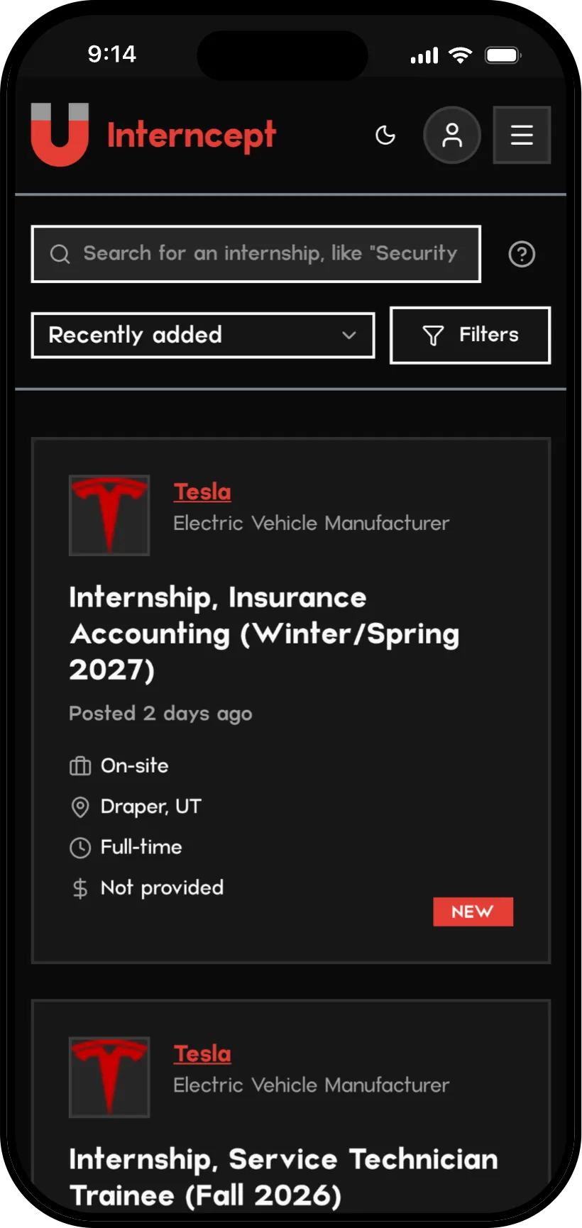
Light & dark
Drag across the screen. Surfaces flip through a single token layer, while Magnet Red and the white source tiles stay put in both modes.


Shipping it
I wrote the product specification and the design system first, then directed an AI-assisted build in Google Antigravity & Cursor: Next.js and Tailwind on the front end, a FastAPI pipeline running on Railway, and Supabase Postgres for data and accounts. Every change went through design QA before it shipped, and the docs are kept current so any new session can pick up exactly where the last one left off.