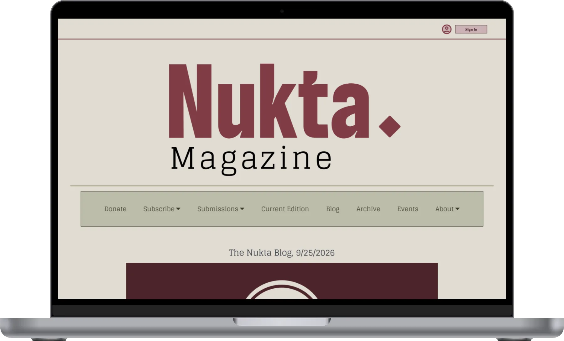
A space for muslim artists to have their creative voices represented and amplified.
Nukta Magazine is a Muslim-led magazine designed to host and promote written and visual art of creative Muslim voices often left without accessible places to express themselves. It honors the religious/cultural traditions and sensibilities its artists hail from while creating space for alternative and sometimes transgressive expression. Nukta, ultimately, aims to reach across the U.S and be the go-to for any muslim eager to share their work, a goal not possible without a clear brand identity and digital hub for artists to recognize and flock to, the goal I was brought on to achieve.
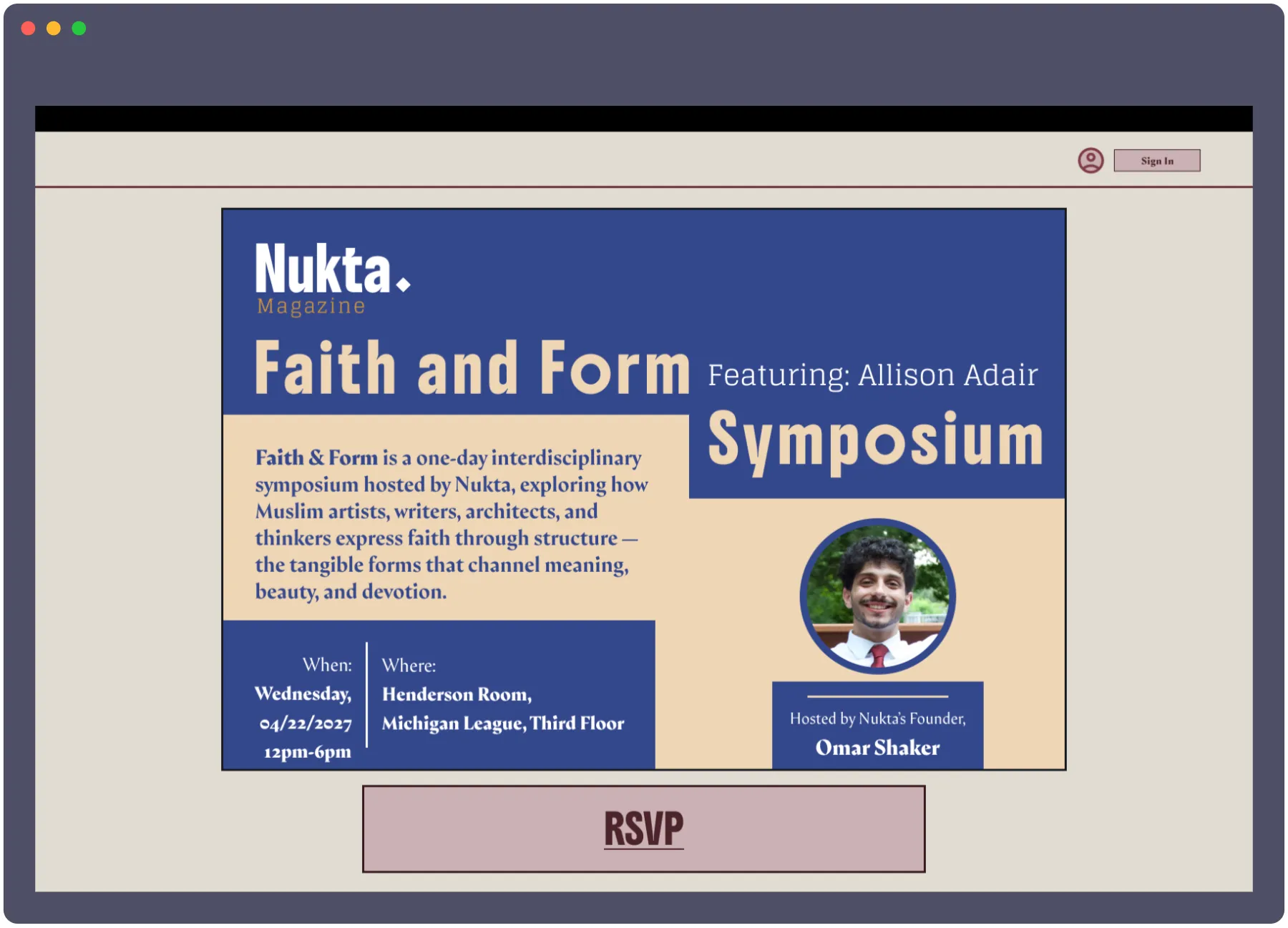
- Nukta requires a cohesive visual brand identity that honors its religious and cultural roots while feeling modern and accessible to the national Muslim diaspora it serves.
- Beyond branding, Nukta needs a functional digital platform that acts as a central hub for publishing content, promoting initiatives, and engaging its community, all while maintaining strong visual consistency.
- To support long-term growth, the organization requires a scalable design system that ensures clarity, efficiency, and consistency as new team members and contributors join the project.
- My Role
- UI/UX Designer/Brand DesignerTeam|Omar Shaker (CEO, Editor-in-chief),Omar Alfageeh (Product designer, Brand Designer)
- Deliverables
- Brand identity, full design system, Hi-fi site mockup, site prototype
- Duration
- September 2025-October 2025
Branding and Visual
Identity:
Paying homage to it’s religious/cultural roots while still being modern and striking, that’s the balance Nukta’s branding had to strike.
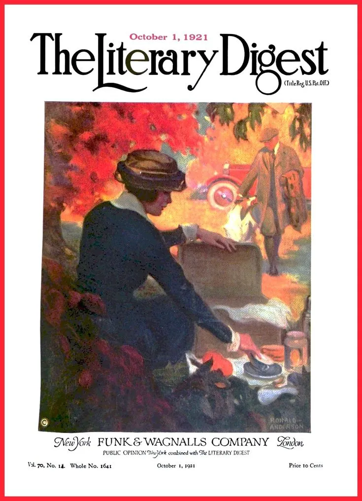
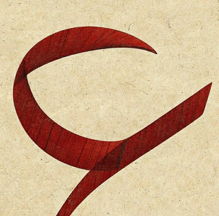
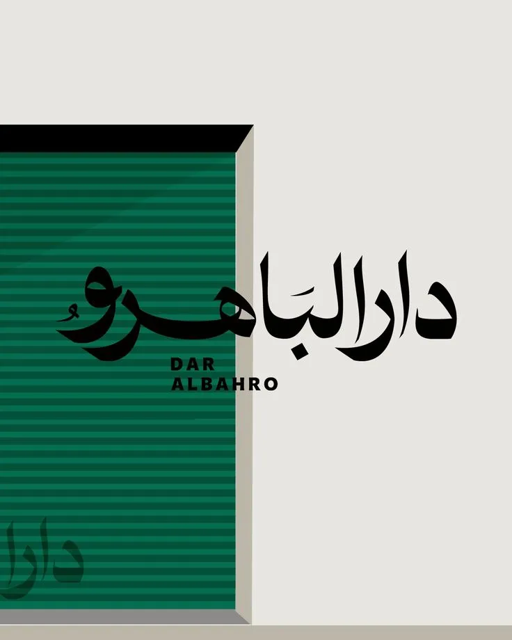
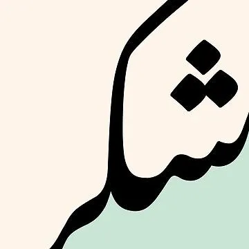
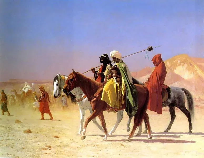
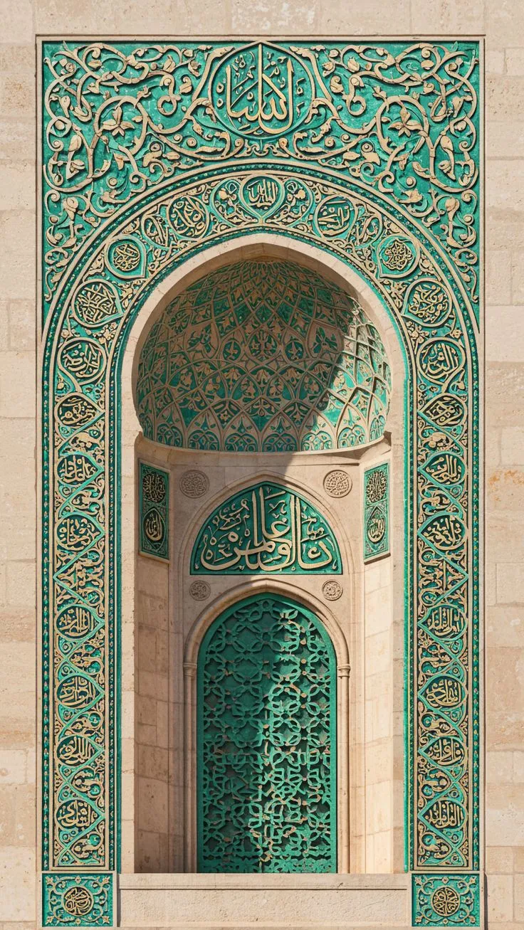
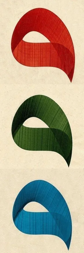
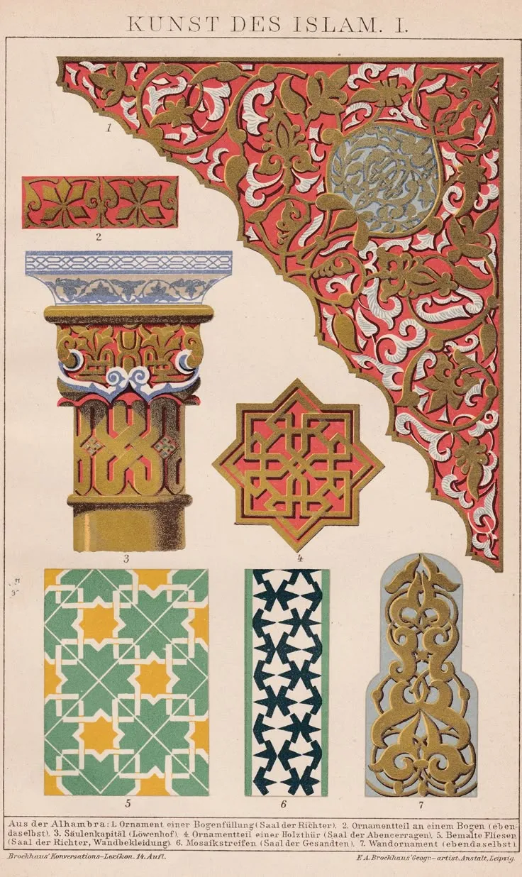
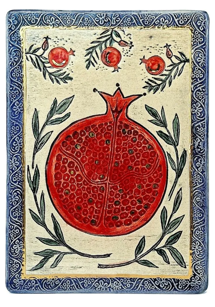
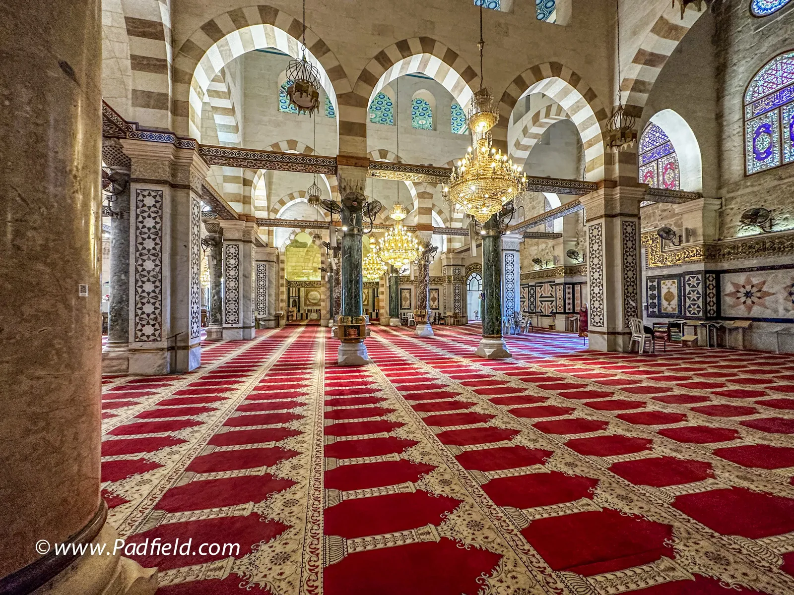
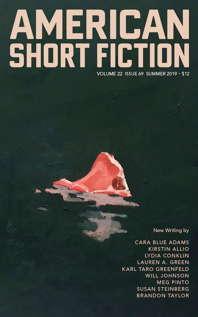
Grounding
Nukta’s branding
influences in it’s identity
as both a muslim organization and literary magazine
was key to setting
the branding process
on the right track.
Colors:
Primary Brand Colors
Secondary Brand Colors
Primary Brand Shades
Secondary Brand Shades
The colors had to be harmonious, striking, and reminiscent of Nukta’s roots. The choice of red, beige, and green and their specific dulled shades was to both anchor the brand to touchstones of its religious/cultural roots while giving it a paperback feel.
Typography:
Logo Font: Boldonse
- Bold, big, and striking.
- Characters ink traps that give the font a pen and ink feel.
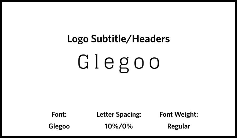
Logo Subtitle/Headers: Glegoo
- Highly legible, slab-serif, and contrasts nicely with the logo font.
- Characters with ink traps that give the font a pen and ink feel.
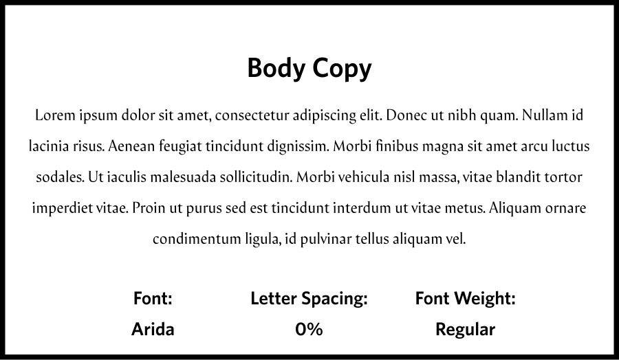
Body Copy: Arida
- Highly legible, but still unique with it’s angular and sharp characters.
- Similar in it’s type design to Arabic type.
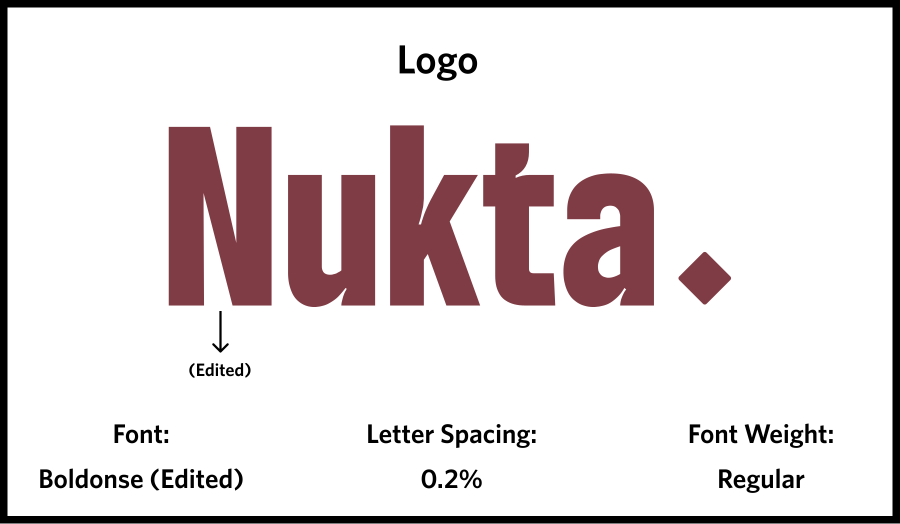
Logo:
Putting it all together...
Nukta’s name is derived from the Arabic word for period or pause, this diamond captures that meaning and gives the brand an icon.
Design System:
Streamlining and standardizing Nukta’s digital product design.
With Nukta’s branding developed, next was laying the ground work for consistency in it’s digital product design. I deliberated on the need for a design system, but ultimately opted for one as the structure it could provide my immediate design process and the design of any future team members was indispensable.
A Three-Tiered Design System:
Brand
The base elements of the design system in their purest form. This is the tools of the design system before their given instructions for use and use cases. The brand collection is the system’s foundation and is meant to be fleshed out and finalized before the alias and mapped collections are developed
Alias
This is where the elements of the brand collection are allocated for their general use. Specific use cases are yet to be defined, but broader groupings for intent in the UI are defined. The alias collection is what separates a three-tiered approach from a two-tier one. The alias collections allows for flexibility as, if a specific instances doesn’t align with the use-cases defined in the mapped collection, the designer can default to the alias collection, maintaining coherence in the UI while implementing the desired UI decision.
Mapped
The mapped collection is the most straightforward and defined collection of the bunch. It’s where the elements of the design system are mapped on to specific parts of the UI (buttons, headers, menus, etc). The mapped collection is the final evolution of the design system. It’s where the designer goes to the most when making design decisions.
After finalizing the variable library, completing the latter half of the design system by turning those design decisions into UI elements via a component library was next.
Buttons
Logos & Icons
Bars & Menus
Misc.
Site Design:
Assessing Nukta’s services and business goals and translating that to a site layout and features.
Now, with brand identity and design system served as the groundwork and blueprints, all that was left was putting it all together in a site that would be Nukta’s central hub, both for user’s and administrators. Working closely with the founder/project manager was crucial as the site’s features and layout needed to be defined and planned for.
Sitemap
Merch Page: User Flow
Lastly, the finished product